
Client / Begin Learning
Roles / Product Design, User Research
Timeframe / Sept 2023 - Feb 2024
Link / Live on Begin website from 2/24-8/24. View Figma prototype here.
In the fall of 2024, after a recent merger, Begin Learning was still working to establish itself as more than the sum of its parts. While HOMER, Little Passports, codeSpark and Learn with Sesame Street were well-regarded separately as kids learning products, there wasn’t a clear journey for our customers, mostly parents, to consider them together. With these challenges in mind, the company conceived of a new premium membership that included multiple products. The question then became, what would be the best way to introduce this membership to users?

Problem
The new membership was relatively complex. There were six different stages that a child could start at depending on their age and needs, each with a different combination of an educational app, hands-on learning kit, and other learning resources. Customers who stayed subscribed would move on to the next stage each year, with a new combination of products. There were several challenges to overcome:
How would parents know which stage was right for their child?
If we recommended a stage, how would we help parents feel confident that it was a good fit?
How could we build trust in a parent company that was previously not well known, even though the individual products were established?
Additional goals included capturing email addresses for future leads, and providing a secondary product recommendation at a lower price point for those who didn’t want to commit to the premium membership. A quiz was determined to be a good format for guiding users through this
My role
After some initial competitive analysis conducted collectively by my team, I was the primary designer assigned to the project. I created an initial prototype, conducted and analyzed user research, and created several iterations that resulted in the MVP.

Process
Competitive Analysis
My team of two other product designers and I began with a competitive analysis to get a sense of product recommendation quiz best practices. A few patterns emerged:
Both short and long quizzes were represented. While some were just a few questions long, others took 5+ minutes to complete.
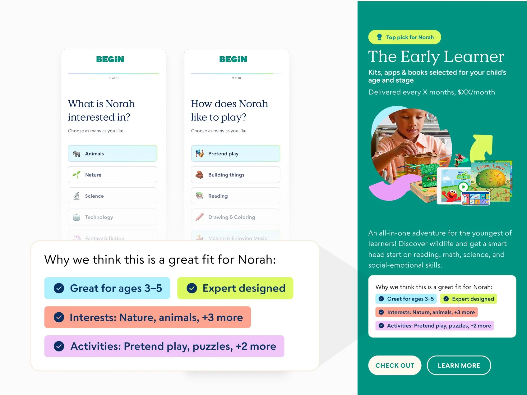
Longer quizzes paid off with more personalization. Users were fewer recommended products but with more rationale about why that was the right fit for their needs, based on their quiz responses.
Interstitial messages delivered value props and communicated brand. Questions were often interspersed with facts and comments that made the experience feel more unique and responsive to user needs.
Given that the primary recommendation would be a single product, my manager and I hypothesized that a more in-depth, personalized quiz would help users better connect with the new membership.
Prototyping and testing
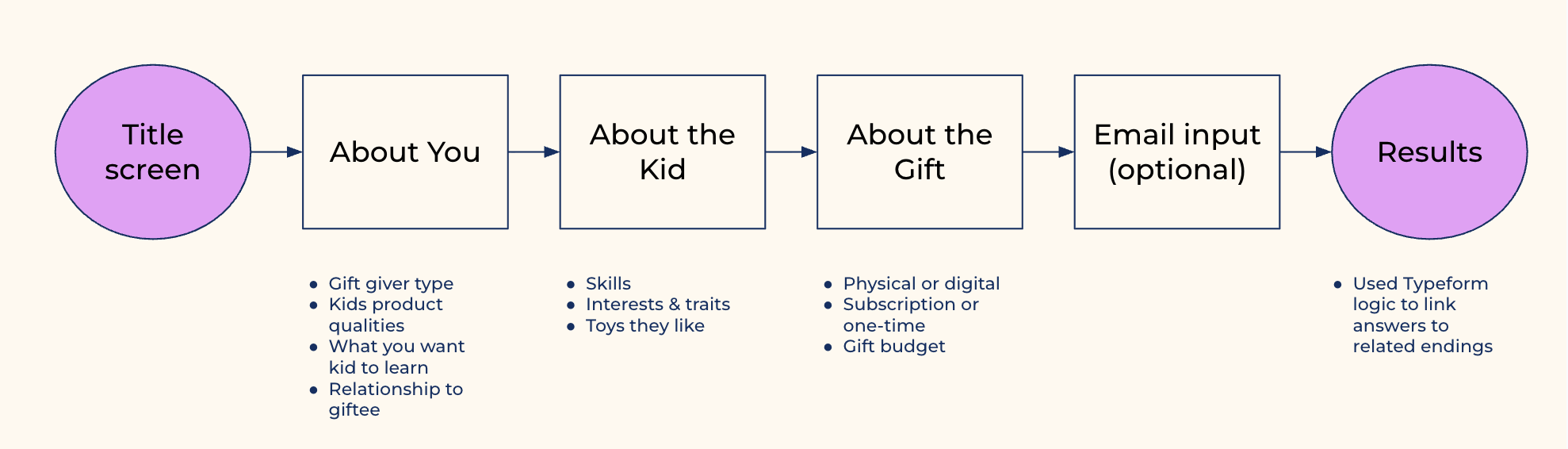
I wrote a 16-question quiz and several interstitial screens. My aim was to establish Begin’s authority in the early learning space while creating an impression of warmth and playfulness. Since I wouldn’t have access to developer time for the prototype, I created the quiz in Typeform.
Unmoderated tests were completed 10 users from usertesting.com, all of whom met a minimum household income, were parents of 2-10 year olds and were decision makers about their children’s toys, games or apps. I reviewed and analyzed recorded sessions, synthesized themes, and shared findings with a small working group which included the product manager, developers, and marketers.
Product definition and stakeholder alignment
Based on the latest direction from senior leadership and learning from competitive analysis and user research, my manager and I worked together to draft a defining document. We then presented this to stakeholders to make our goals aligned.
What business goals are we solving for? Increase customer lifetime value by offering a premium membership that combines multiple product subscriptions into one.
Who are our users? Adults (mainly parents) interested in fun, enriching products for kids ages 2-10. Users will primarily arrive from social media ads targeting high household incomes and levels of education.
What do we want users to do? In order of priority: 1) Purchase the new premium membership. 2) Purchase of a single product subscription. 3) Provide an email address so that we may follow up on the lead with targeted relevant content.
What needs are we filling for them? Users are likely considering multiple products for their kids. A membership that offers several experiences in one may save them the time and energy on shopping. They want to feel confident that they’re choosing something that’s high quality and a good value.
How would we like users to feel while interacting with the quiz? Engaged and having fun, or getting the impression that their child would have fun. Feeling like they learned something.
What do we want this quiz experience to communicate about Begin? That we are a credible and knowledgeable early learning company that offers high quality play-based products. Our memberships are customized to their child’s age and stage, and are relevant to their family’s needs.
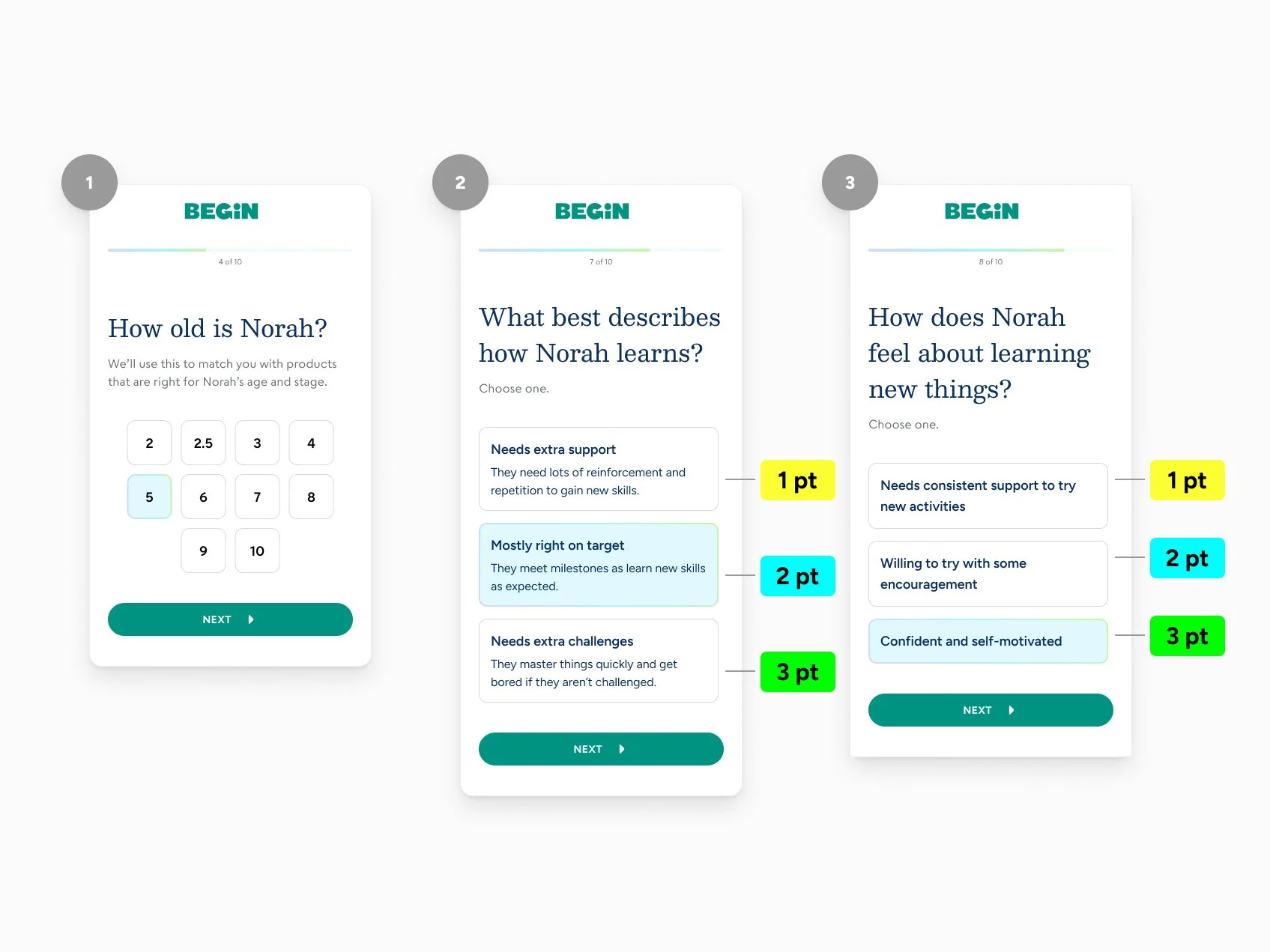
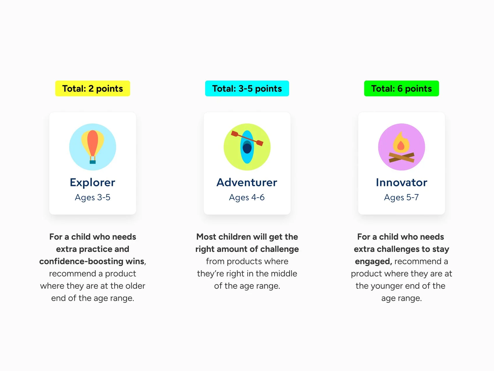
What constraints are we working under for the MVP? To decrease complexity, use point-based logic system similar to the existing HOMER quiz.

Design Iterations & MVP
Proposed and documented Quiz Logic
Reactions to the prototype quiz’s content were positive, but Typeform’s built-in logic didn’t allow much control over which result users saw. Users were dissatisfied when they got a recommendation that didn’t fully match their answers. I knew that the final logic would need to be thoughtfully designed to deliver results that felt truly personalized.
Optimized Optional Email Capture
Lead collection was a tertiary goal of the quiz experience—Less important than purchases, but still desirable to reach users who dropped out at the consideration phase. In initial testing, participants gave feedback that optional email collection was a standard and expected step of a product recommendation quiz.
Expanded on preliminary Design system
Since Begin’s website redesign had only been launched 3 months prior, it was important to create assets in line with the preliminary design system and properly document them in Figma.
Outcomes
High engagement and completion. XX% made it to the results screen.
The membership ultimately did not find a good product-market fit and was discontinued after several months.
Reflection
Designing for a new platform was a great learning opportunity. Because I and everyone else at my organization were so steeped in browser and mobile app conventions, there were some features early on that had to be radically reworked or scrapped. For example, a "remove from watch history" functionality which would have been handled with a simple tap or mouse click on the web proved too complex for an OTT interaction.
It was also interesting to confront the limitations of standard prototyping tools in simulating a remote control-based interface. While designing for the original launch, I created a clickable prototype using Sketch and Invision. During testing, users often mistook the product for a website because of the way they had to navigate it in the browser.
For the second iteration, I used Axure to create a Roku remote that users could interact with in their web browsers. Although it was an improvement, it was still pretty removed from sitting on your couch watching TV! From proper text size to realistic browsing behavior, there were many things that just couldn't be properly assessed in a browser-based interaction.
If I were going to be working with OTT design on a regular basis, I would be interested in finding better prototyping and testing options. What do the big streaming platforms, like Netflix or Hulu, use?